digital art. I taught myself how to code and quickly became fascinated with making things people could interact with and use. Being able to build my ideas opened a whole new world for me and I soon created my first
  I like to move between idea and implementation, physical and digital, visual and verbal. Exploration and curiosity are driving forces in my practice.
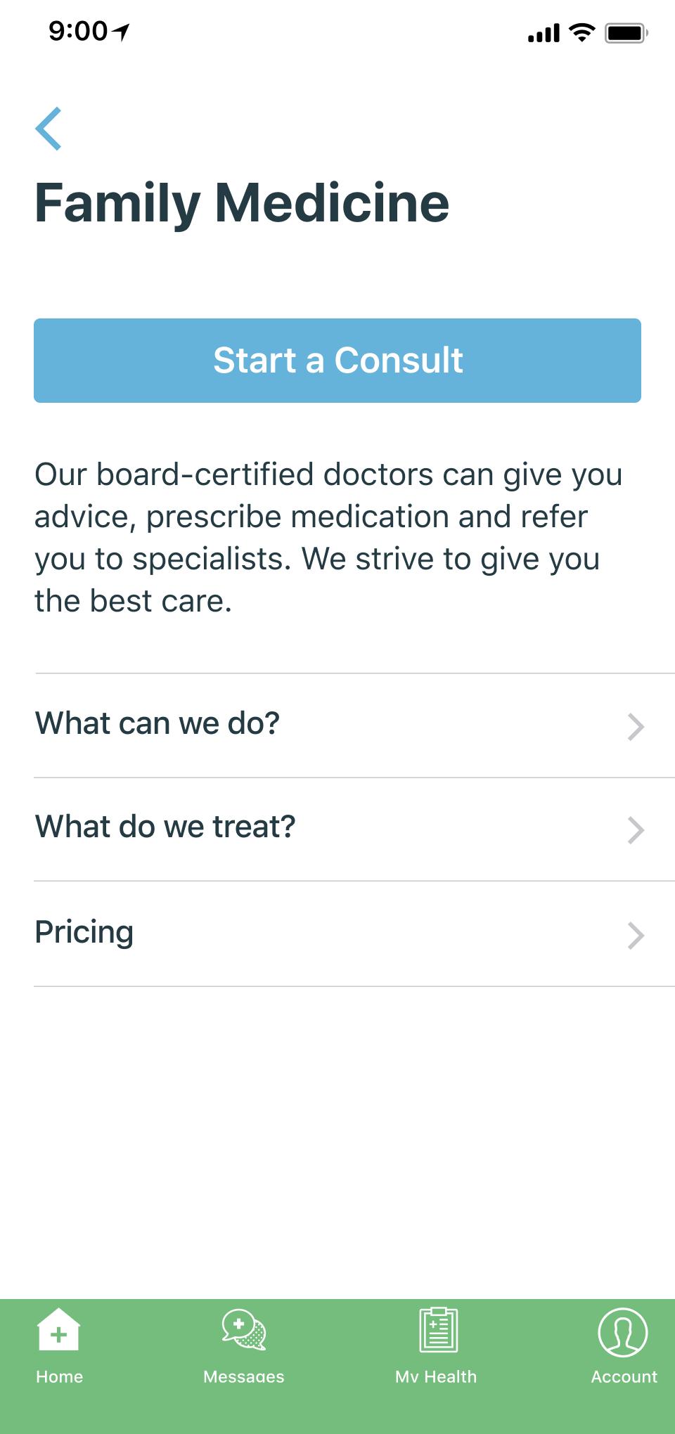
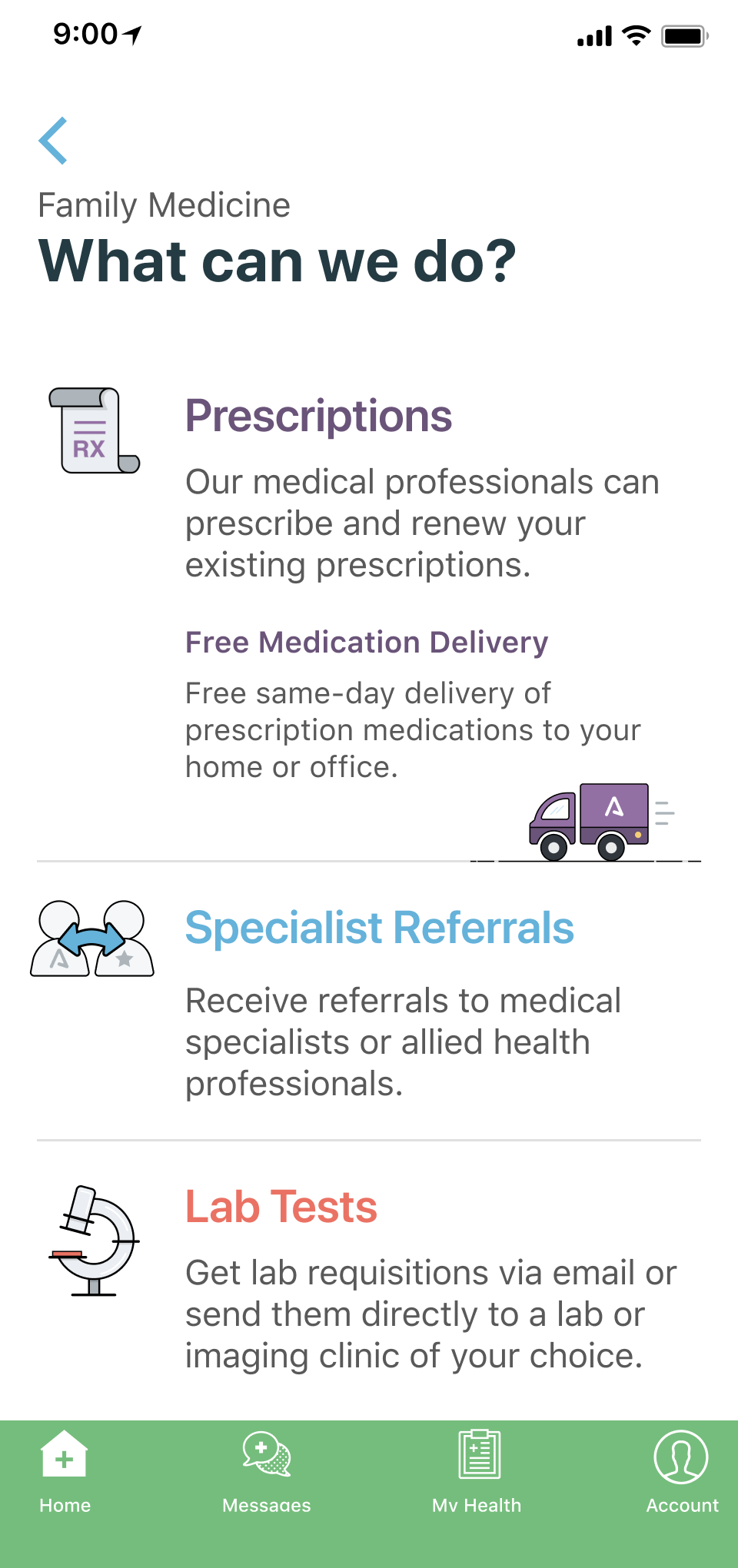
Canadian telemedicine service providing care in family medicine, mental health and diet & nutrition.
- · IOS, Android Apps
- · Desktop web app
- · Website design & build
- · Branding
- · Illustration
- · Print & Digital marketing materials
- · Role: Founding Designer
- · 2016—2018
- · Acquired by Telus
Project
Better Onboarding = More Patients
Problem
Paying subscriber numbers sucked! App downloads and account creation looked good though, and existing patients loved the service – we just needed to do a better job of proving our value to new users.
Solved
- Overhauled the onboarding flow
- Reworked the home screen
- Removed barriers for users


Outcomes & Accomplishments
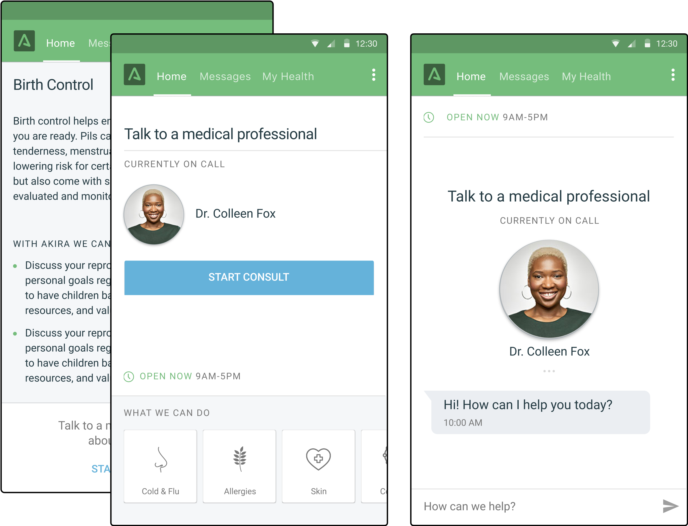
Engagement++ Lowered time to respond, fewer abandoned chats, more questions/deeper conversations.
Growth New company role created (Intake Coordinator) and went from 1 to 2 doctors on-call/day, hours extended from 5pm to 11pm.
5x Conversation rate through the roof. Pretty much saved the company.
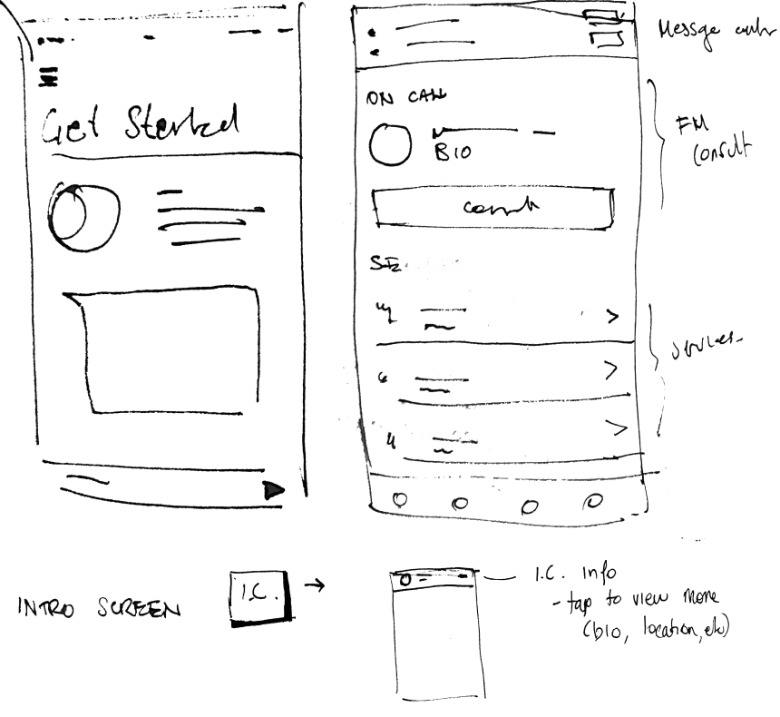
↳ What we started with*
- 6-part questionnaire form
- When finally done with that, users were met with an overloaded homescreen
- Still had to talk to a doctor to actually pay for a plan and validate ID
- And then finally, after all that, they could receive care.
* I did not design this. It was the result of a pre-seed “MVP” design-everything-at-once sprint.


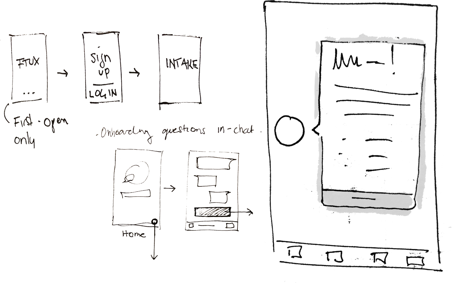
↳ A Path Forward: Home Experiments; A/B Testing
Two ideas
(A) Give them all the information
(B) Get rid of the forms, let them experience the real thing
- Android app was already hybrid web view, so I proposed testing variations without the need for complex dev work
- Aimed to address most common user questions and concerns
- Ran A/B test for one month
- Tracked all interactions so we could make an informed decision
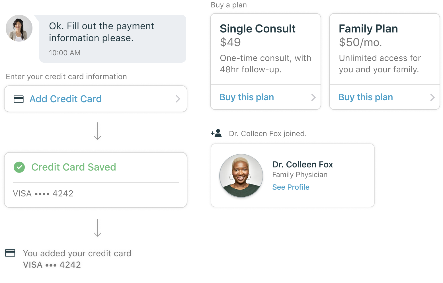
We realized immediately that variant (B) would lead to a much more manual process for the doctors, requiring them to collect patient details one question at a time. But, it allowed them to establish rapport, and people felt they were receiving care right away.
The result was an instant and sustained spike in paying users. But it needed some finessing...
With a clear winner in hand, I massaged the concept further, using feedback from medical staff and users.

New Flow, New Role
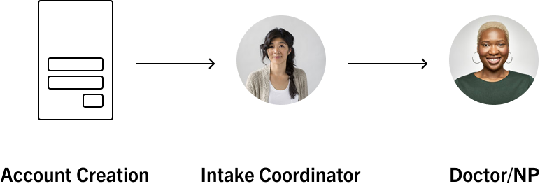
- With so much new traffic, medical staff were overwhelmed!
- I looked to real life process in a medical office, and so, the Intake Coordinator role at Akira was born.
- IC responisiblities: triage – vet, verify and onboard new patients.
- Much more human and natural ✓
- New Home screen + service list now made more sense once onboarded
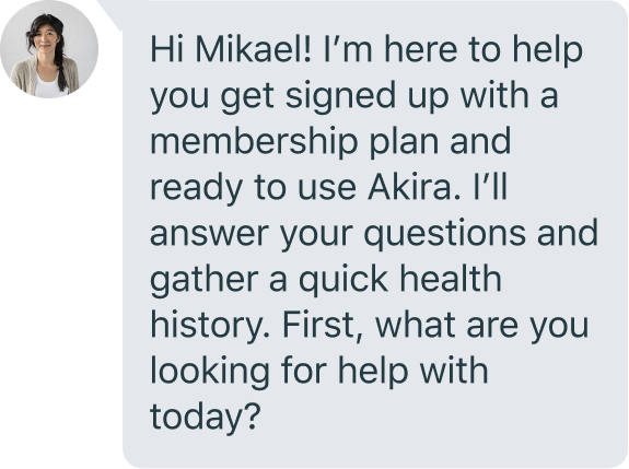
People don’t read—or do they? We found people actually read this first message; probably because of the less formal text message format.
Interestingly, this chat-based onboarding took much longer to complete than the form-based one, but people responded well to the bespoke feel.
↳ Other Improvements Made
Along with a much improved onboarding, I updated other parts of the app including various chat elements, secondary screens and copy.


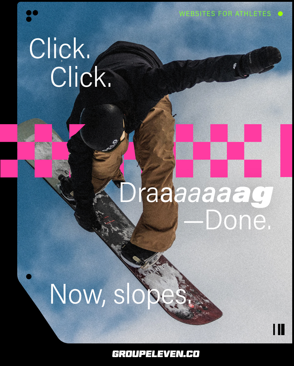
A web app for athletes to quickly and easily create professional websites, with unique sport-specific features.
- · Responsive Web App
- · Website design & build
- · Branding & Identity
- · Apparel
- · Founder/Designer/Developer
- · 2019—
- · www.groupeleven.co
Project
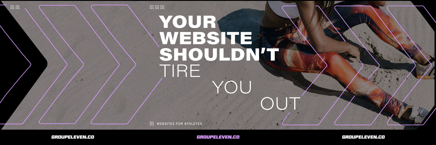
Websites faster & easier than your 5k pb
Problem
Crafting a professional online image is difficult, websites are complicated and time-sucking endeavours. Athletes prioritize training first and things like websites last – they don’t have the time, energy or knowhow, and have been burned by tech in the past. Even world champions and Olympic medalists have sub par online destinations.
Solved
- Extremely quick, simple setup & updating
- Clean, professional look on all devices
- No designing or coding required

Outcomes & Accomplishments
MVP Went from initial idea to first paying user in six weeks.
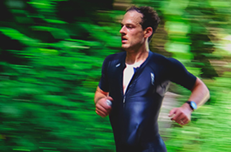
Success Users include Olympians, world record holders, top ten finishers at world champs and Pan Am Games (as well as amateurs).
$$$ Profitable (small numbers but in the green!)
↳ Responsive Web App
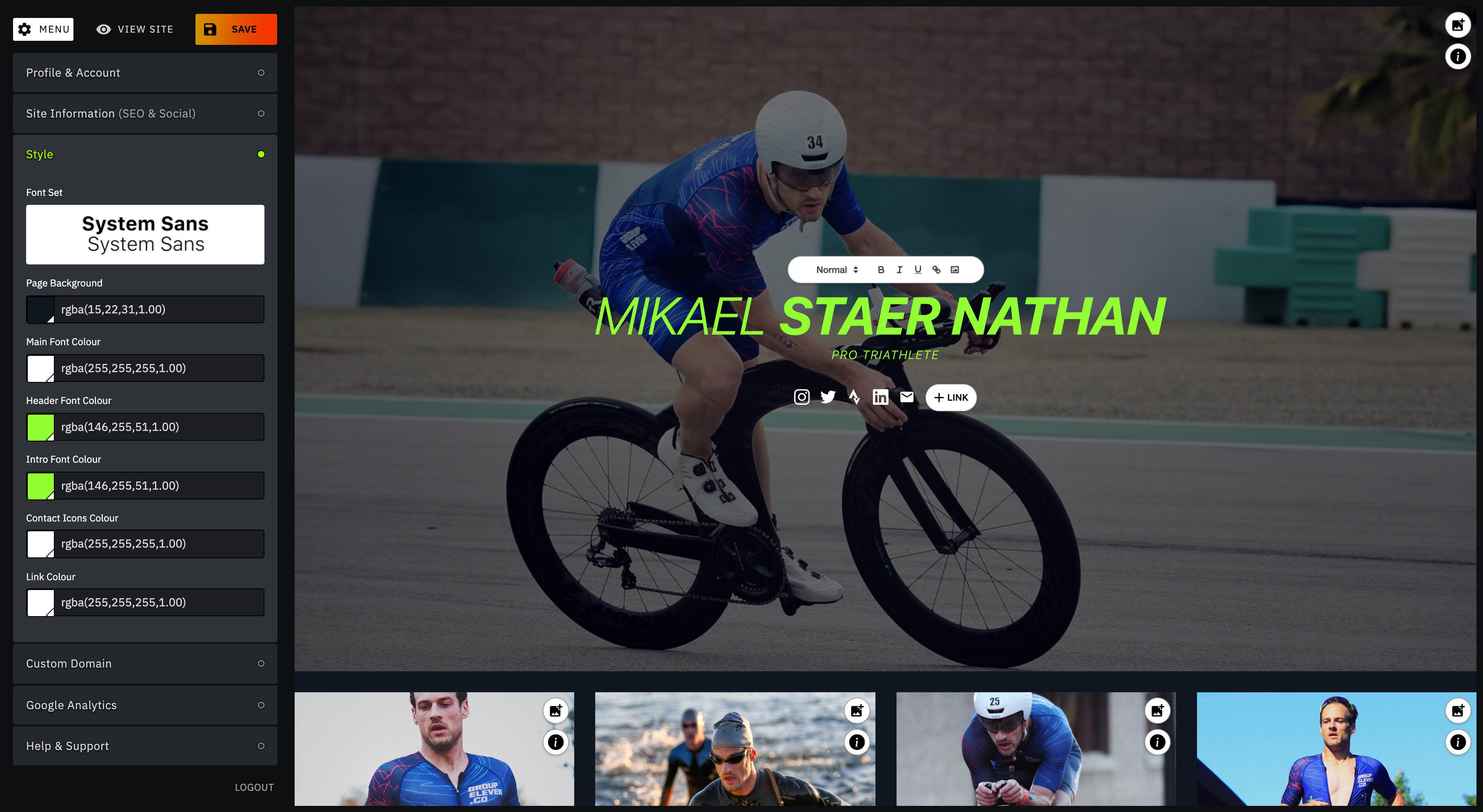
- Fixed layouts with content hotspots keeps things simple and focused: fewer decisions to make means less headache.
- WYSIWYG: No abstractions, edits are made directly on the page itself.
- Customizing fonts, colours and other settings is very straightforward.
- Olympic Games London 2012 1
- Olympic Games Rio 2016 2
- Olympic Games Beijing 2008 6
- Olympic Games Athens 2004 19
- World Series Championship 2010 2
- European Championship Baku 2015 1
- World Championship (U23) 2005 3
- World Championship (U23) 2003 3
- World Series Montreal 5 Olympic Distance
- World Series Hamburg 8 Sprint Distance
- World Series Hamburg DNF Mixed Relay
- Grand Final, Lausanne 10 Olympic Distance
- World Cup Tongyeong 5 Sprint Distance
- World Cup Miyazaki 4 Olympic Distance
- World Series Montreal 5 Olympic Distance
- World Cup Lausanne 1 Olympic Distance
- European Championship, Glasgow 2 Mixed Relay
- European Championship, Glasgow 1 Olympic Distance
- World Series Hamburg 8 Mixed Relay
- World Series Hamburg 4 Sprint Distance
- National Championship 1 Sprint distance
-
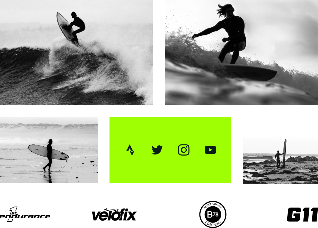
G11 pages are focused on the essentials:
· Results
· Social Links
· Sponsor Logos (that are linked)
· Images + Text
- Page layouts are purposely designed to be content-light, functioning more like an athletic C.V.
- And provide just the right amount of info & personality.
↳ Brand & Identity
I wanted Group Eleven to look energized and bold, and feel inspired.
Logo
BT Brik Xl By Burntype
Colours
Deep Sport #081D19 R8, G29, B25
Flare #FF2E00 R255, G46, B0
Electricity #9FFF03 R159, G255, B3
Typography

Acumin Pro By Robert Slimbach
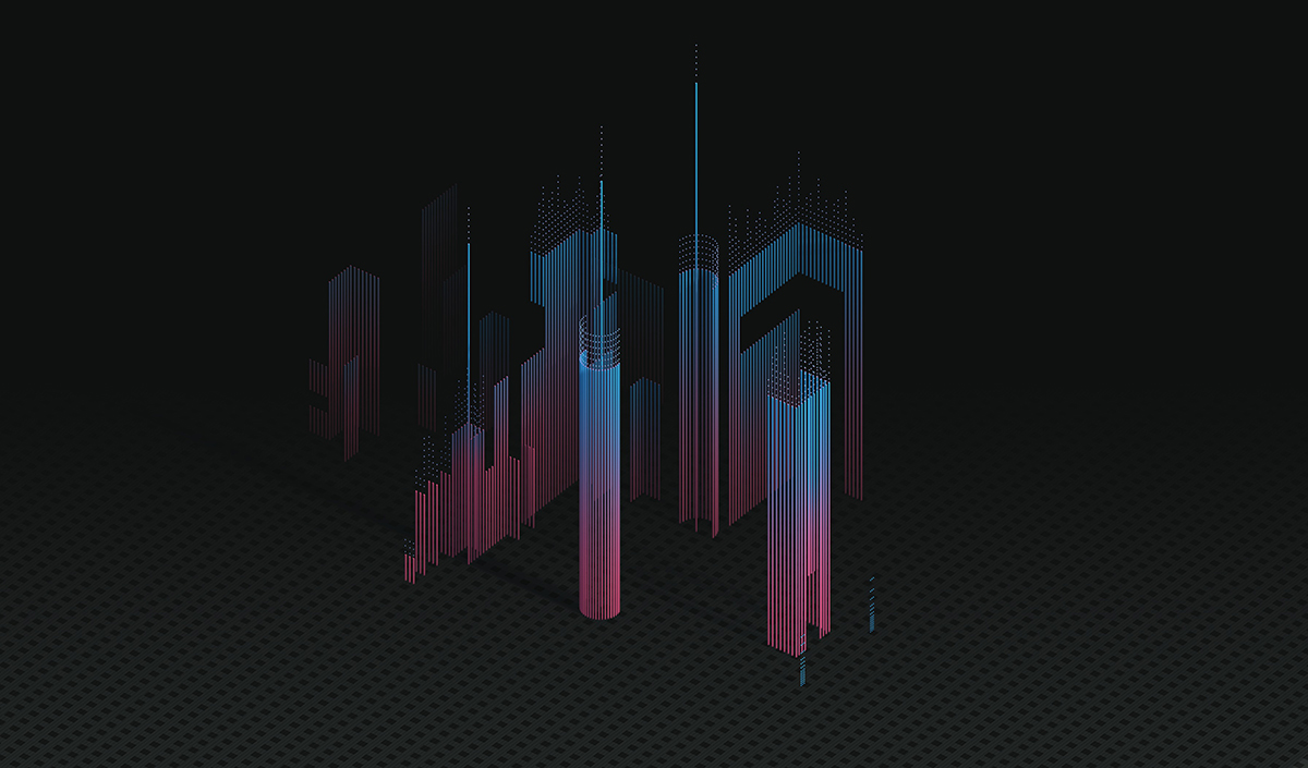
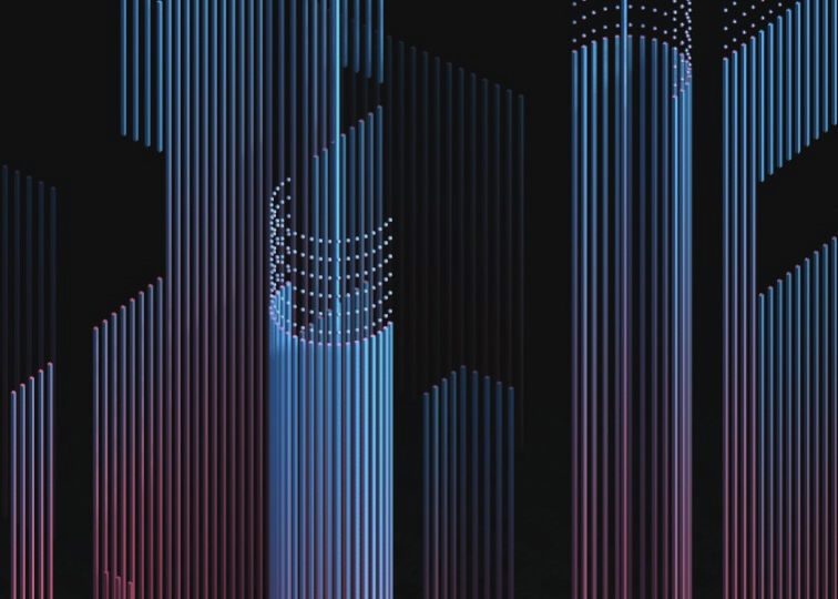
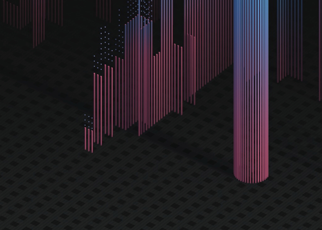
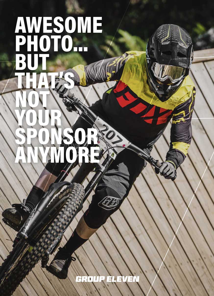
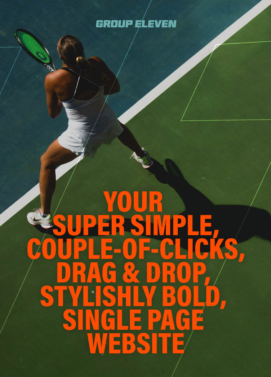
Promo Imagery

↳ Behind the Scenes
Some thoughts, musings and process behind developing the project.

The Idea I wanted to use Group Eleven as an exercise in product development – putting to use the lessons I have learned throughout my career.
I also wanted to challenge myself to create something that people (and a particularly stingy audience) would be willing to be pay for.
Validation Having a great idea and ability to build is one thing, but does anyone actually want it?
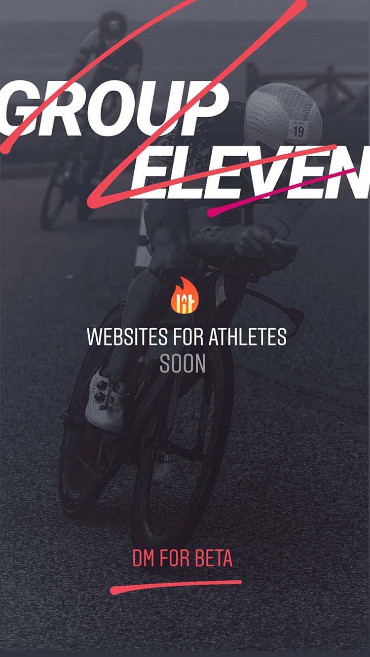 I promised myself I wouldn't build anything unless I had strong signals from my target demographic. I have nearly 800 followers on Instagram, most of them athletes. I posted a single image to my stories with a prompt—DM for Beta—and required a minimum 10% conversion within the first 12 hours in order to proceed.
Approach to Building: MVP / MAP Design and build only with strong signals and validation. Go manual as long as possible: no automation/abstraction until absolutely necessary.
MVP / MAP means, "What is the minimum that needs to be built for people to buy/use this thing?" Depending on the audience, that may be smaller or bigger. For G11, it was bigger, as the audience is non-technical and would not do well with less-than.
I favour a SWOT-style analysis that looks at excitement/interest around proposed functionality, with a demonstrable need or desire.
For example, I added video support because it was easy to implement, allowed greater creative expression, and brought a champion athlete to the platform.
Naming From my notes, "Must be cool sounding but also look good typed out." Aesthetic to the ears and eyes (lol).
"Group Eleven" is the periodic table grouping for gold, silver and bronze (copper).
Other names considered: Podium, Top Step, Aurum (gold), 79 or Seventy Nine (atomic number for gold).
No Blog The personal blog for athletes is mostly dead. Social is where it’s at for them (Instagram, YouTube). The blog format has been the default for years, but very few have the writing ability, dedication & interest to update regularly.
Nothing is worse than “Last Updated: 2 years ago”, and honestly, no one but your mom is reading that 2000 word race report covering your first bowel movement of the day to the post-race drive back home...
Remove the guilt and anxiety, and suddenly you've created delight.

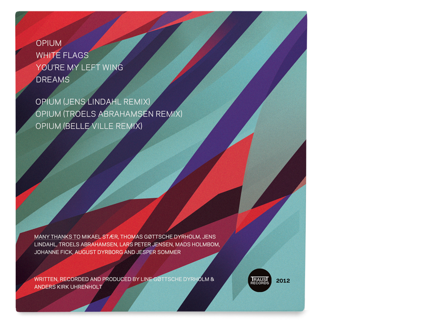
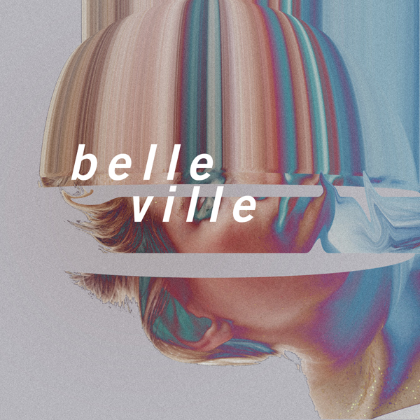
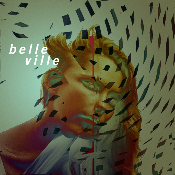
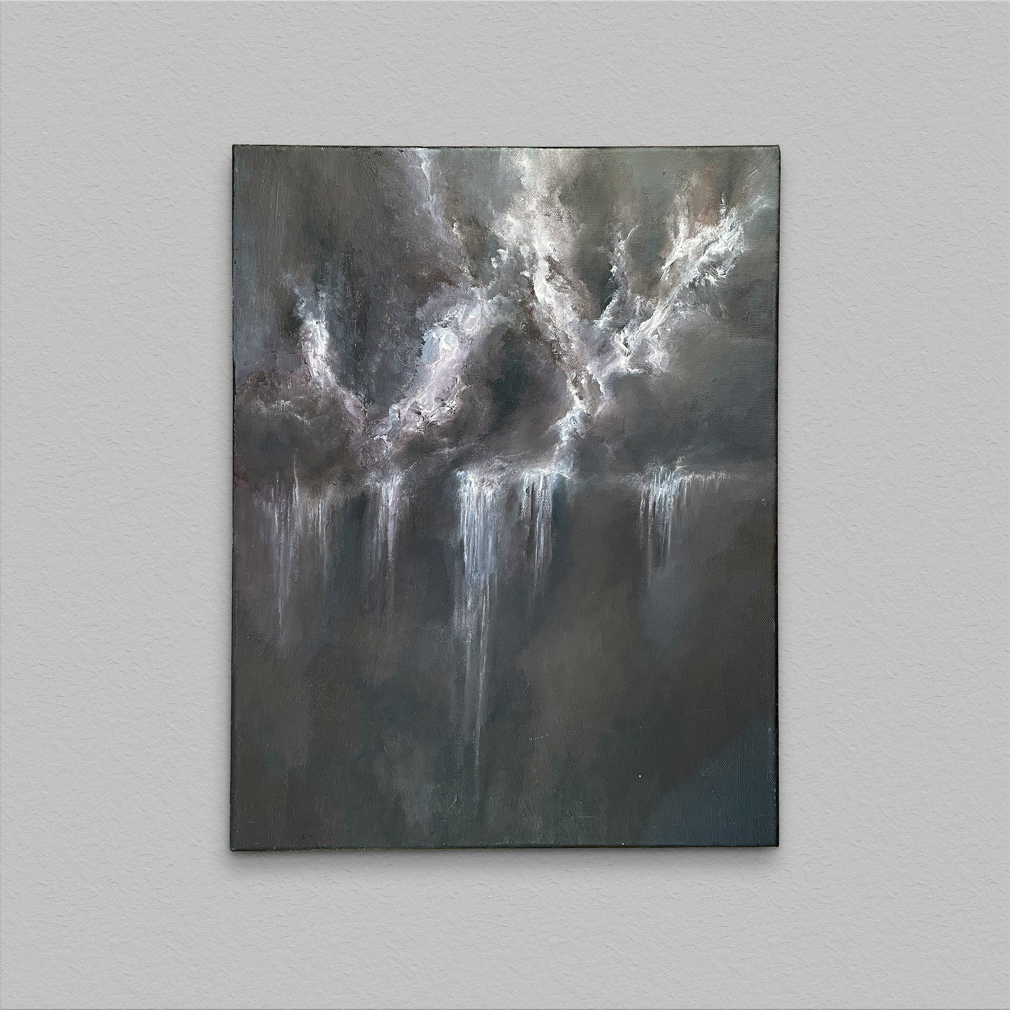
Album cover for Danish electronic band, Belle Ville. 2012.


Dear City
Dear City allowed people to write to their city, about their city. Founded in 2009, under the name Kære København ("Dear Copenhagen"), it expanded first to a few cities within Denmark, then by popular request to other European cities, and finally in 2013, to the rest of the world.
When it launched, the mayor of Copenhagen, Frank Jensen, said,
‟I believe Kære København will create another important space for communication between the citizen of Copenhagen and the city council.”
Indeed, the first expansions to other Danish cities were commissioned by those municipalities and used to gather feedback from their citizens.
It was nominated for an Index Award in 2011, and featured on The Atlantic, Strombo, Bettery Magazine, Fast Company and had a front page feature on the Copenhagen Metro weekly mag.
In collaboration with Philip Battin.